Hello! I’m Kim, San Diego Photographer who specializes in family photography. I’m going to start sharing more about my process of shooting and delivering a session. As with any creative process, I think we gain a greater appreciation of the final result when we can see the process of getting to that point. With photography, when you see a photo, I think it’s easy to be deceived in thinking how easy it may be to get that final image. In future posts, I will share more about how I shoot, but first, I want to share about how much editing has an impact on the images that get delivered in every gallery.
When I first started shooting in manual mode with my DSLR, it was frustrating that I couldn’t get the image to look the way I wanted it to. I couldn’t create the vision I saw in my mind, so I paused for a bit and started shooting with my phone. Using my phone’s camera, I didn’t have to worry about my settings, so I could simply focus on what and how I wanted to capture something. I could focus on the composition of the image, and with just a few editing tweaks, the image matched better to my vision than what I could get with my DSLR camera. Eventually though I picked the DSLR back up and started to bring my images into Lightroom to make edits and that started me down the path to where I am now.
I now comfortably make significant edits in Lightroom and Photoshop to get an image to match my vision. Every image gets imported into Lightroom where initial edits are made to exposure, white balance, color, and other settings, followed by additional edits in Photoshop. When I deliver images to my clients, I really like to clean them up so that they are the focus in them. I remove people and things from the background that might be a distraction. I love light and warmth, so I usually add or highlight these elements in every image. I paint with light to highlight certain aspects I want the viewer to see and I darken areas to de-emphasize other ones. I am a keen observer, so I will even remove flyaway hairs if they feel like a distraction to me, even if no one else may notice.
The following images show the image straight out of my camera, next to the final image I delivered to my clients. All of the images have been edited to be brighter and bring out the color, but I also made additional edits to create my final vision.
After sharing some of my edited images, I will be sharing a link from Robyn Scherer, a fellow local photographer, who has a beautiful post about how college kids need headshots too!
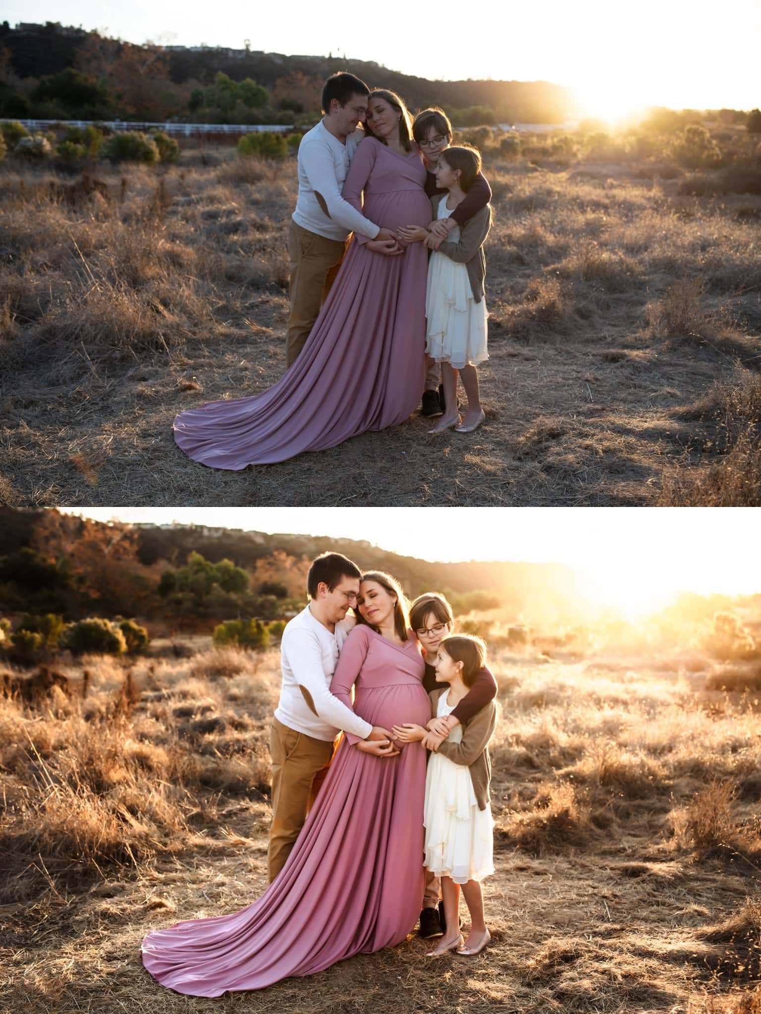
And now here are my before and after shots. In this image, I removed the white fence so that the viewer’s eyes wouldn’t be drawn to it.
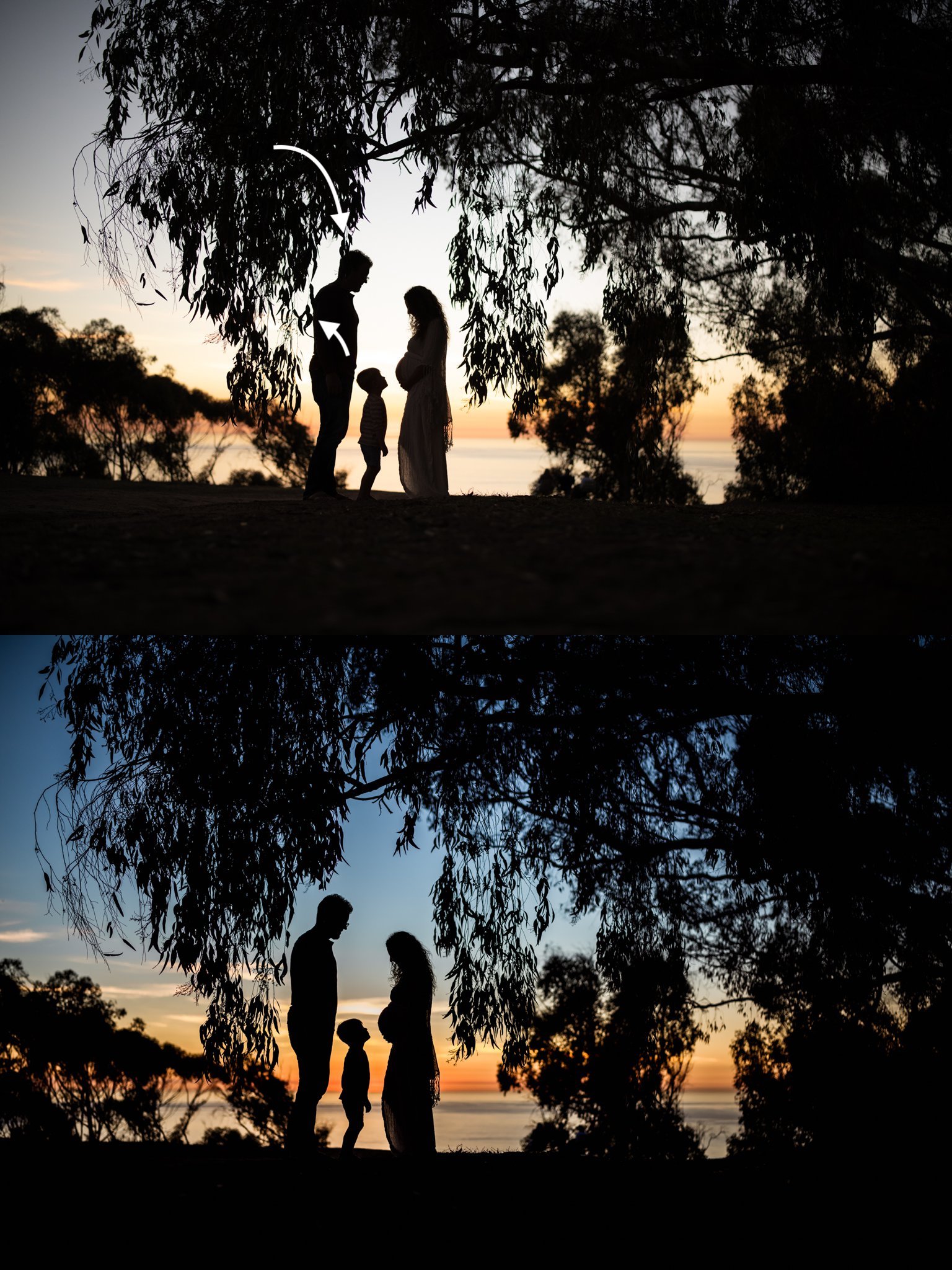
I loved capturing this silhouette of this family. In the original image, the leaves were touching the dad’s head and back and I wanted to create more space, so I removed them.
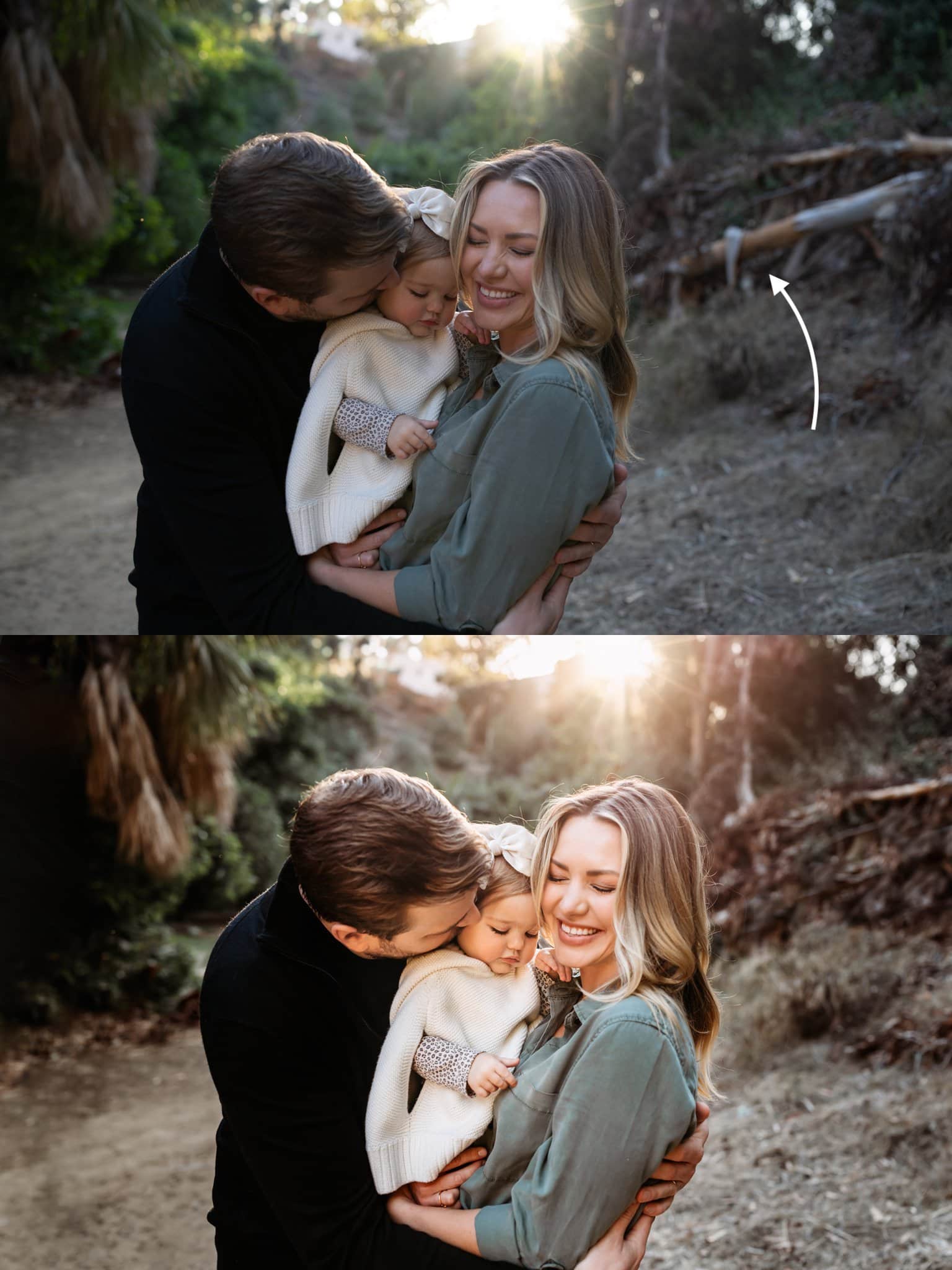
The fallen tree trunk was a distraction in this image so I removed it.
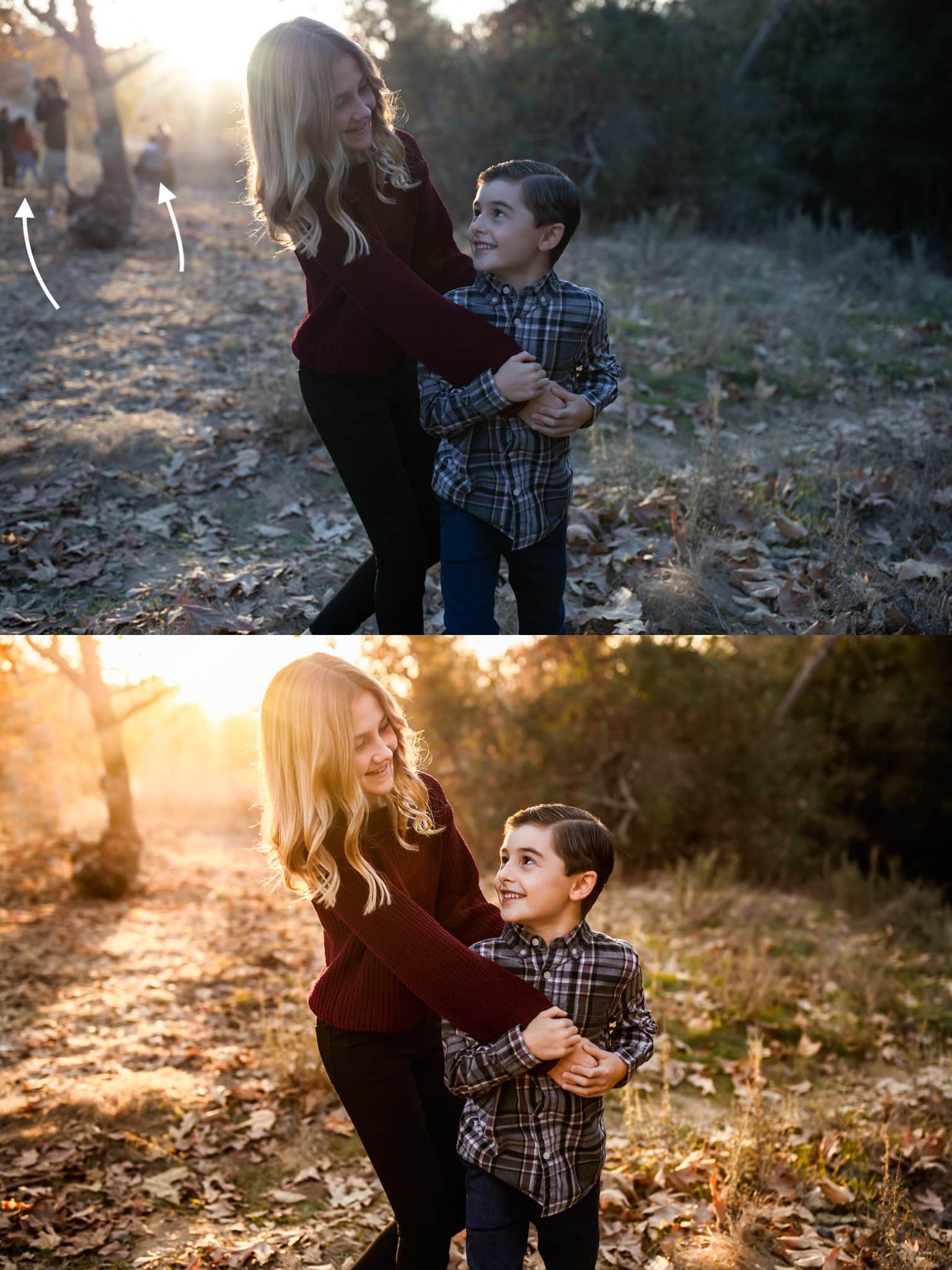
If there are people in the background, I will almost always remove them, even if they’re in the distance and blurred out.
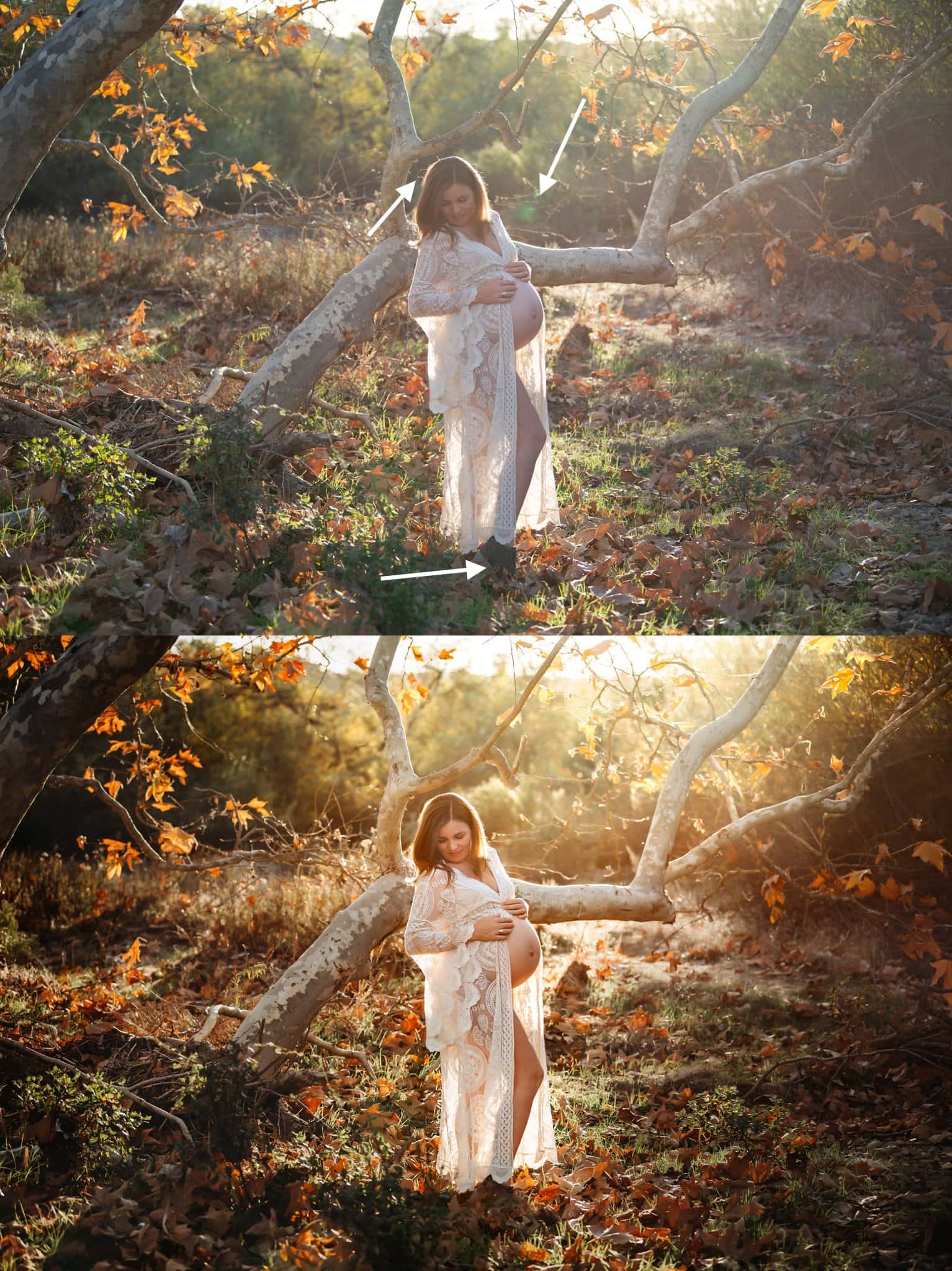
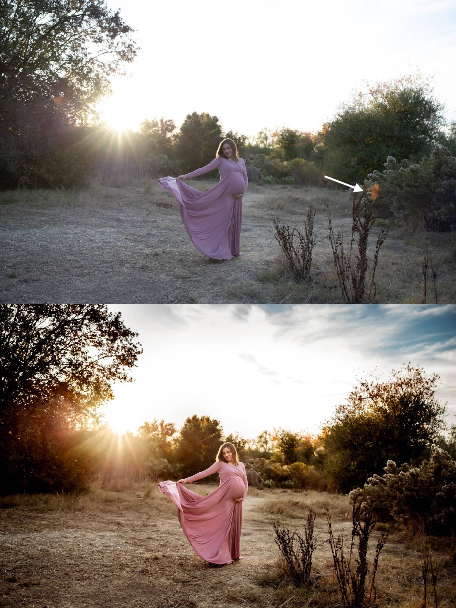
There was a bit of haze and green lens flare in the original image that I removed. Additionally, this mama was wearing brown shoes and so I blended them into the leaves and I removed a couple of flyaway hairs. The flyaway hairs are barely noticeable, but removing them all contribute to the beauty of the final image. This is an image where I also painted the light. I emphasized the direction of it coming from the top right of the frame and then darkened the sides of it to help make mama the focus.
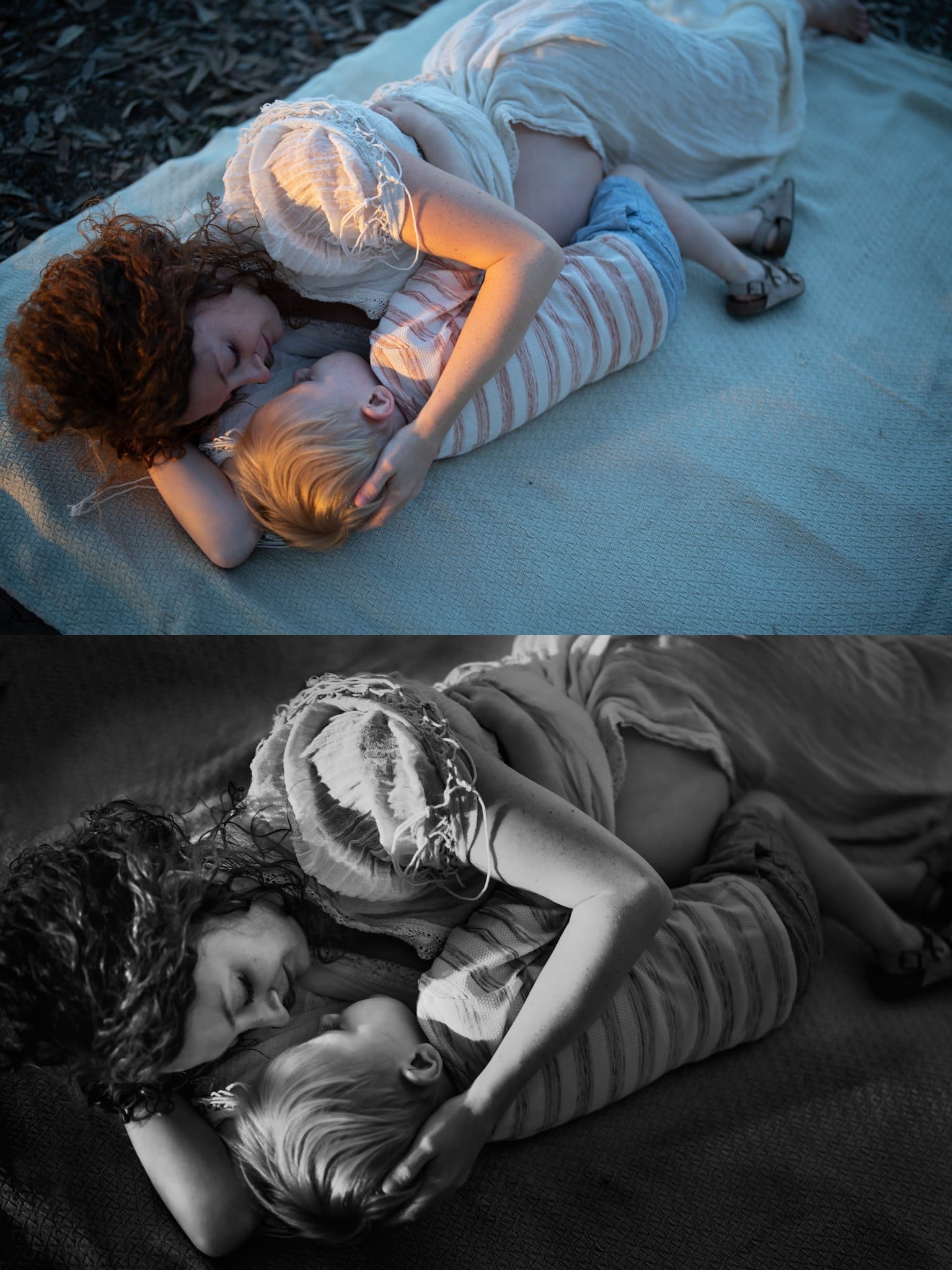
To focus on the connection, I cropped in closer and painted the light on their faces. I also extended the blanket.
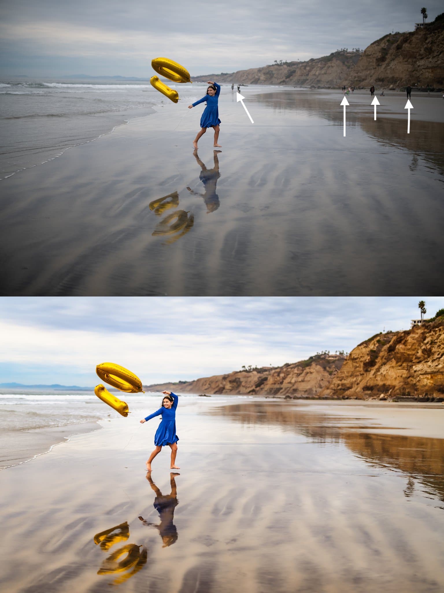
In this image, instead of centering her in the middle of the frame, I wanted to create a stronger composition by placing her in the first third of the frame. While the people in the background are small and not very distracting, I still wanted this image to be only about the birthday girl, so I removed them.
To preserve the color of the sky, I had to underexpose the original image, but in editing, I was able to bring up the exposure while still preserving the sky.
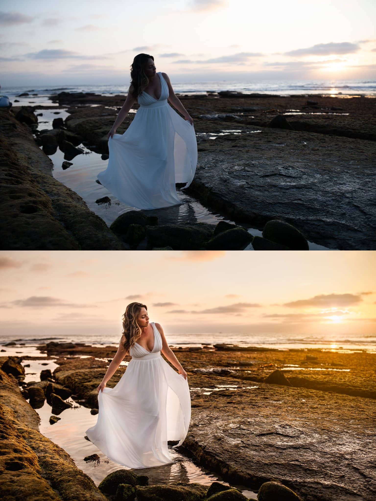
There was a bit of lens flare that I removed in this one. I also brought back some of the blue sky that is barely noticeable in the original, and then bring out the warmth in this backlit image.
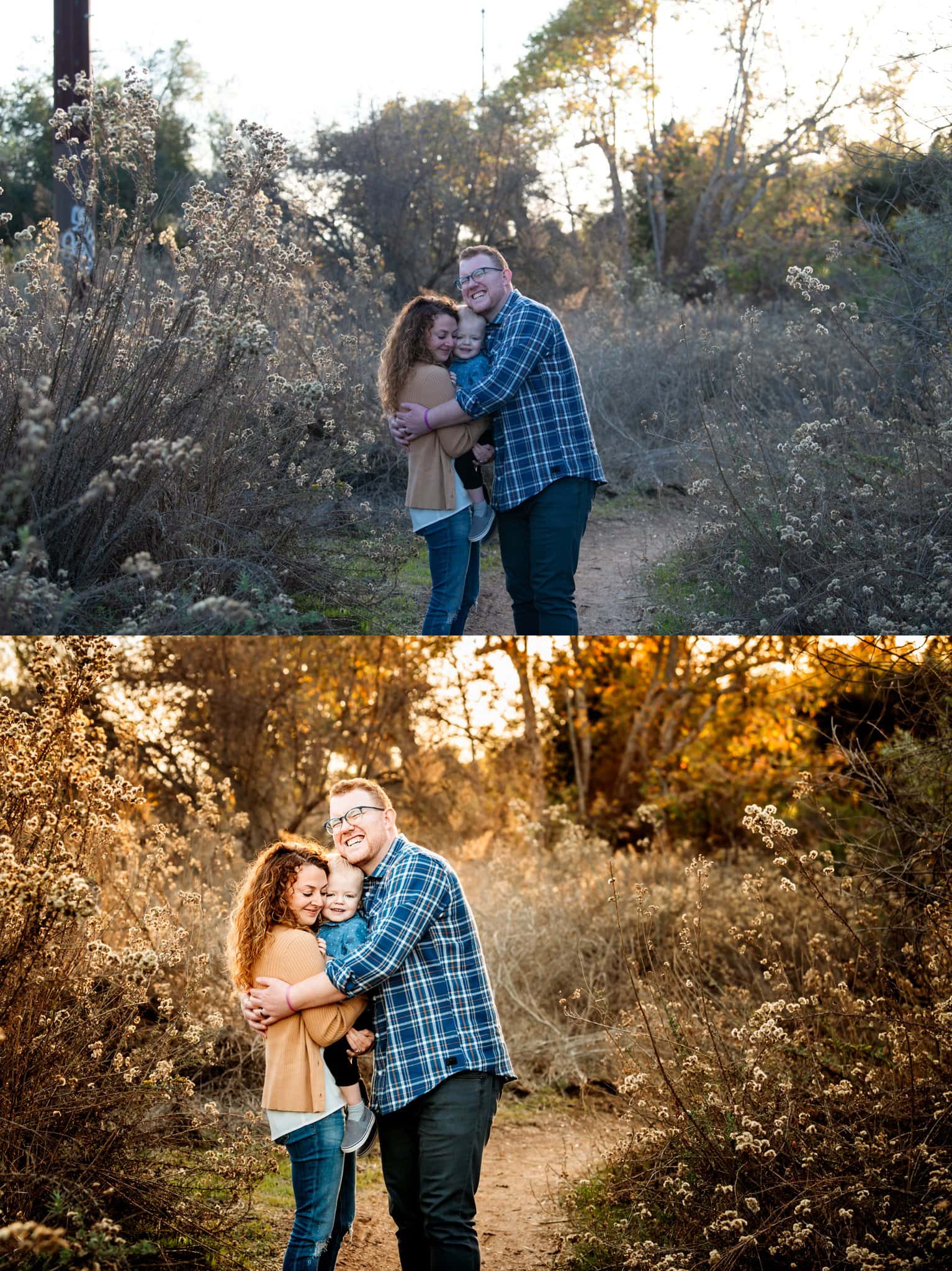
To make the composition of this image stronger, I decided to crop down to put my clients in the rule of thirds. This helped me crop out the pole, but also brought them into the frame better.
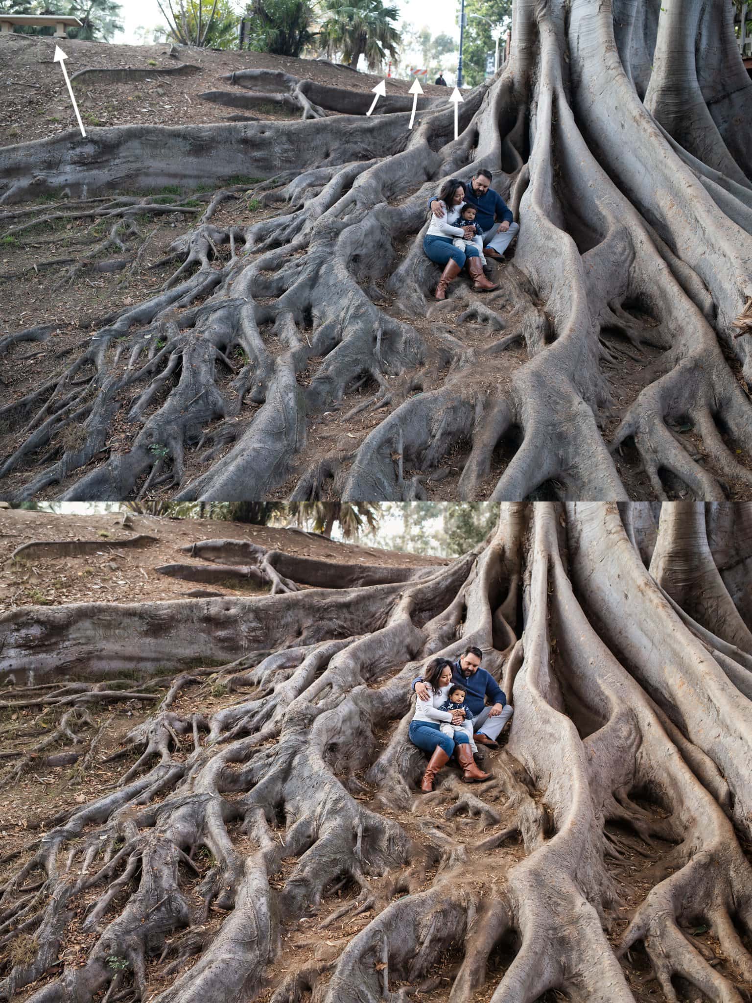
There were several distracting items at the top of this image, so I removed them all.
I hope you enjoyed seeing and reading about how I create the final images through editing.
Also, don’t forget to check out the post by Robyn Scherer, Premiere San Diego Photographer, with some really gorgeous headshots of kids in college.
Want to read more? If you’re looking for a San Diego Photographer and you’re ready to book your photo session but not sure what to wear, make sure to check out the following post…

+ COMMENTS
add a comment